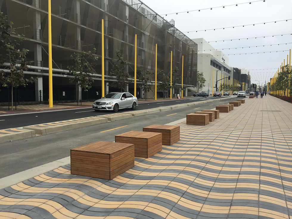
Last month I was lucky enough to hop on a plane to LA thanks to my mom for watching the kiddies and my husband for letting me tag along on his work trip. And what a treat. In terms of planning and urban design, here's a part of the country that really gets it right. South Florida, pay attention.

One Uber ride to Santa Monica from West Hollywood and I was greeted by this! A multi-tasking street with a mesmerizing pedestrian promenade, exclusive bike lanes, creative seating and festive overhead lighting.

They even added an artistic directional guide to break up the pavement pattern and direct visitors to other points of interest. Notice the direction to Expo Station--LA's light rail.

A few steps further led to a modern and rather inviting bike station. Individuals can rent bikes or use their own bikes to commute around town while bike techs service their bikes and store them during the day. Most of these stations are located on the ground floor of parking structures which have been built in partnership with the city.

They even have lockers and showers for hard core work commuters.

The green bike lane in the image above includes a clever twist- a broken green line to communicate that bikers use caution as they approach an active driveway.

And above is another example of how the bike lane is integrated into the city street. The broken white lines along the parking lane provide an additional alert of potential cyclists. And further up the street, the bike lane markings are broken to show a shift in the lane alignment. Simple and clever!

And here is my absolute favorite. The plantings in the medians and sidewalks are quintessential California. What a picturesque path for the cyclist fortunate enough to be in Santa Monica.

And for the pedestrian, there is an equally charming path to cross this lovely street to the Art Deco City Hall. Not only is there an adorable "look" sign- a throwback to the streets of London, but there are four changes in pavement material including a kind of rumble strip and a decorative sewer grate. Just gorgeous! Clearly Santa Monica is using European models for their street details.

Santa Monica takes street crossing design to the next level at an intersection between the Third Street Promenade, the city's pedestrian only shopping district. This design (called a scramble) is even more beautiful because of the colored granite material and the simple bollards. And, of course, the regal quality of the buildings give the illusion that you are in a European plaza.

Here's a glimpse of what the interior of the Third Street Promenade looks like.

And here's another view of the promenade with a European cafe set on an island in the middle of the street.

A simple design for a bus stop is both functional and elegant.

And finally a wide and generous crosswalk across from the first street I laid eyes on in Santa Monica.
Here is a place which has incorporated new standards for bicycle, pedestrian and transit design that really work and are truly beautiful!

