Miami Design District versus Beverly Hills: Inspiring Minds Want to Know
- Melissa Hege
- Feb 26, 2017
- 4 min read
Last May, on a trip to LA, I snapped a bunch of pics of my favorite neighborhoods including Beverly Hills. But it wasn't until I returned to Miami and drove through the Design District that I considered the possible connection between these two coastal shopping meccas. Could it be that the Design District was modeled after the famed Rodeo Drive? I believe the Design District is an even better version of the old school Beverly Hills. Here's why.

Let's start with branding. Beverly Hills' brand is its name and its logo pictured above. Maybe some of you can remember those Camp Beverly Hills t-shirts that came out in the 80s? It started with the design pictured above.

Now the Design District has similar branding to Beverly Hills, but takes it one step further by using iconic art pieces like this one pictured above. Buckminster Fuller's 24 foot dwelling prototype, called Fly's Eye Dome, reinforces the Miami Design District's mission for home and fashion and it's also really cool. More than that, this geodome has become the symbol for the Miami Design District.

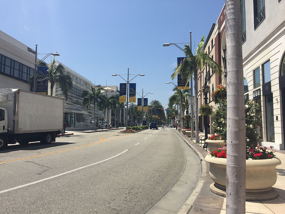
Let's face it, everyone comes to Beverly Hills for the shopping and the possibility of spotting a celebrity or at least the latest reality tv show personality. But it all starts with great streets. The storefronts in Beverly Hills are precious and particular to each store...


...but the storefronts in the Design District are like jewelry boxes or a special gift. The wrapping is so beautiful that I can't wait to open the door and see what's inside.

While the streets in Beverly Hills are perfectly coifed with stately palms and flowers...

...the Design District has beautiful majestic oak trees which elegantly frame the street and the storefronts.

While Beverly Hills has the critical sidewalk cafe for optimal celeb spotting...

...the Design District has real public spaces which are wrapped with beautiful storefronts and dotted with thin and spindly palm trees which fill the space to make it comfortable and almost cozy. More public art and the geodome creates some levity so that we don't take ourselves too seriously!

And then there are several pleasing spaces, like this one, which allow people to cross through the middle of the block between more precious building. The double height of the buildings frame the space. I especially love the bright orange paint which reminds us that we are in Miami!
Here they are setting up for Art Basel with these temporary sculptures.

Here's another view of the passageway from the street. The stone pavers lay across the pavement as a kind of elevated crosswalk to alert cars that people may be crossing the street. If you squint your eyes you can almost imagine you're on a Parisian street. Notice the Parisian bollards and the white arrows painted on the asphalt street.

Beverly Hills has designed their crosswalks a little differently. Think of this as a modern take on the Paris crosswalk median. Here, the sidewalk slopes down to align with the bold white stripes of the crosswalk. And beautifully planted medians separate cars from the people crossing and provide an extra layer of protection from moving traffic.

Here's another view of the crosswalk in action! At this close range you can see how the designer scored the stone with horizontal lines to create a change in texture. Good for people walking and texting. They don't even have to look up to know that they are approaching a busy intersection (see example above).

Let's take a look at the sidewalks. This Design District sidewalk oozes class as long as you don't look too closely at the brickwork. Miami is not known for it's great artisans and the pavers don't perfectly align, but the overall effect is tres chic.

I imagine that if Beverly Hills could upgrade their sidewalks and streets in the future, they could easily rival the Design District. But for now, I like how they dress up a fairly plain concrete sidewalk with modern planters and a railing to carve out the restaurant's domain.

Developers of the Design District transform the mundane everyday necessities of a commercial neighborhood into things of beauty. Let's start with this fun and simple take on directional signage for the men's room. They've transformed it into a sculptural piece of art!

And on a larger scale, is a stunning parking structure which looks more like a sculpture than a utilitarian building. It almost appears to be dancing especially as the light moves across the metal screen. Boy did they get this one right!

But my favorite, and the best example of why I think the Miami Design District is an improved vision of Beverly Hills is this. Remember the iconic geodome in the public plaza? Here we can see it's real purpose- as a formal entrance to the underground parking deck. How often do you see tourists photographing a parking entrance? Pure genius! Thanks to Beverly Hills for the inspiration, this time Miami really did get it right! Evidence that developer driven projects, like this one, truly can have a transformative impact on an entire neighborhood. Google Dacra for more information.

